SurveyLegend brand assets
Our name
SurveyLegend is one word, and always should be spelled with capital “S” and “L”. When using our name inside a piece of text, it is totally fine to simply type it and it does not have to look like our wordmark.
You do not have to include the registered trademark ® sign in your written text, but if you do, we will be very happy and appreciate it. However, please try to include the trademark sign in the main headings and titles.
Our Tagline
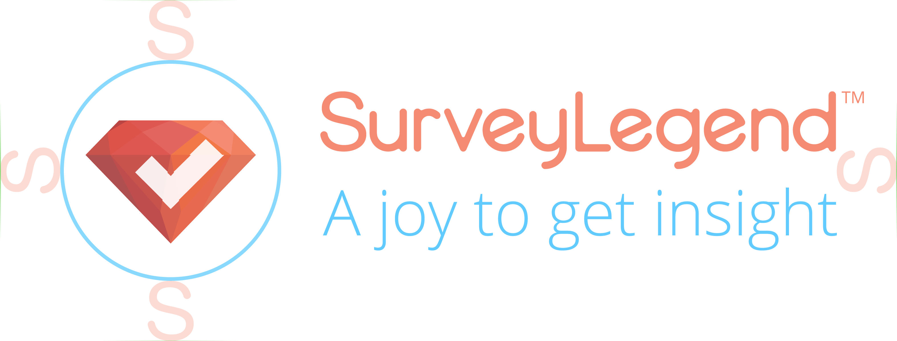
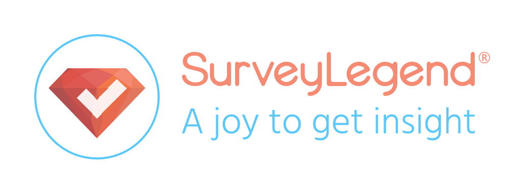
A joy to get insight
SurveyLegend’s wordmark (logotype) is custom-made, so there is no font that can be used to create it. You have to download it in one of the available formats to be able to use it.
 It is OK to use solid colors for the wordmark if you wish to change the color to fit into the supporting design. But you are not allowed to use any sorts of gradients for the color. Just remember that the registered trademark (®) sign is a part of our wordmark and should always be with it.
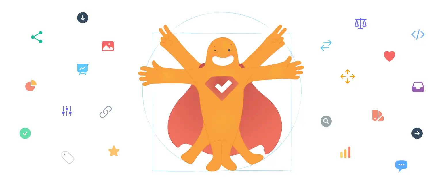
It is OK to use solid colors for the wordmark if you wish to change the color to fit into the supporting design. But you are not allowed to use any sorts of gradients for the color. Just remember that the registered trademark (®) sign is a part of our wordmark and should always be with it.SurveyLegend’s logo (sign) is a red gem containing a white checkmark, surrounded by a beautiful blue stroke.
![]() Surveys are all about people’s opinions (ideas, votes, choices, thoughts, preferences, feedback, etc…) These opinions are like precious gems; and there are many who need this invaluable information. However, when these opinions are buried deep down somewhere that no one can reach or notice, they have no value.
Surveys are all about people’s opinions (ideas, votes, choices, thoughts, preferences, feedback, etc…) These opinions are like precious gems; and there are many who need this invaluable information. However, when these opinions are buried deep down somewhere that no one can reach or notice, they have no value.
When presenting SurveyLegend apps, use this app icon instead of our normal logo. We use the same app icon on all platforms.

SurveyLegend Asset Usage
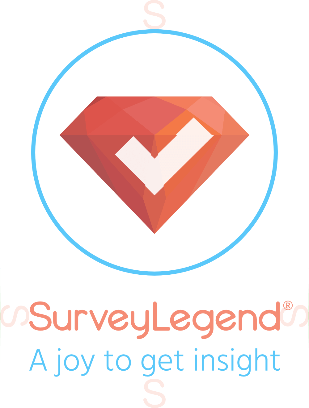
This is our standard lockup. When you are in doubt, use this version.![]()
This is our second standard lockup. When you don’t want to show the tagline, use this version.![]()
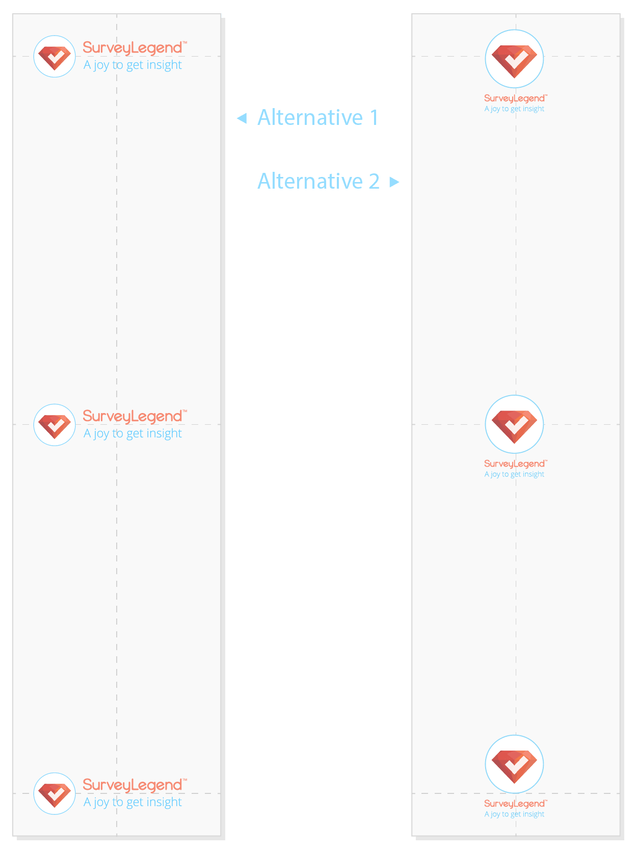
When your layout doesn’t allow using horizontal space, you can use this lockup.
![]()
Use this version only if SurveyLegend’s name or Wordmark is clearly visible or presented in the design or the page where you want to place it.
⋅ Clearspace and minimum size
Please respect our logos and let them breathe. Provide a minimum space around the wordmark and logo. The minimum clear space around them should be not less than the height of the letter “S” in the wordmark.
 Additionally, when used in printing, the letter “S” should be at least 0.2 inches (0.5 centimeter) in height.
⋅ Placement
When using our trademarks in graphic communications like print, newspapers, billboards, or web banners, align the trademarks to one of the four corners of the frame. Always include enough clear-space on all sides of the trademarks.
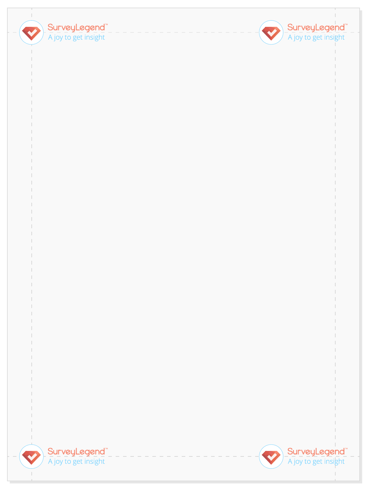 In case of space limitations, align the trademark to the center of the frame.
In case of space limitations, align the trademark to the center of the frame.