Here is the next SneakPeek of our amazing and gorgeous solution and survey data :)
Hi Legends,
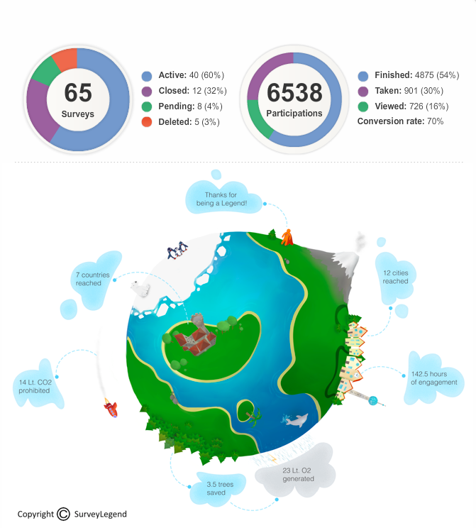
This page shows your overall statistics. In the donut charts, you’ll get a quick overview of how many surveys you have created and the total amount of participants that have responded to your surveys. All this is presented in a beautiful way, if we may say so ourselves.
The gorgeous earth you got the chance to see last week has a bigger meaning than just looking sweet. Actually, it shows real time Survey data, in a joyful way. If you take a look at the clouds you will see that every single cloud has some data in it (except one, which one?) – don’t be shy, have a look…
We also present the number of trees you have saved by choosing to use online surveys instead of paper (boring and not very environmental friendly) surveys.
Next week we will be presenting our Live Analytics page. If you think this was cool, wait until you see Live Analytics, and more ;) so stay tuned.
To subscribe for the beta, click here: SurveyLegend
Have the best of days!