



 Live Analytics
SurveyLegend’s Live Analytics provides you a detailed and beautifully presented overview of your collected
responses. As soon as you publish your survey online and start gathering responses, you can immediately
see how your live analytics will keep updating before your very eyes.
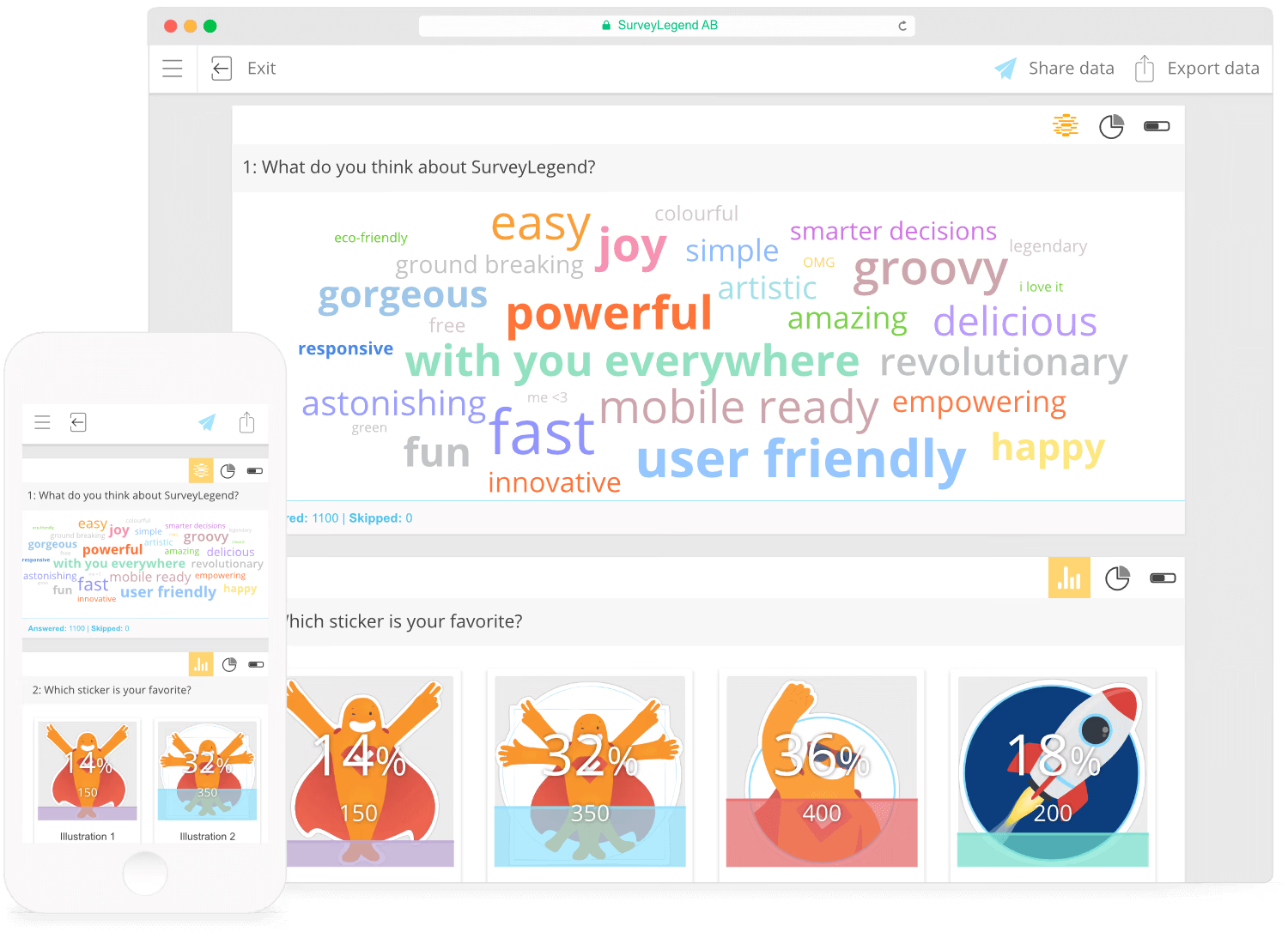
Our real-time data analytics can be accessed both on your smartphone, tablet, or desktop computer.
 Date range
You can preview survey statistics within certain time frames. By default, Live Analytics
shows the statistics from the second you have published your survey, until the current
moment. However, you can limit the time easily by choosing a start date, and an end date. That
will trim the collected data to the chosen date range.
 Participation Diagram
The Participation diagram illustrates very simple data, which is very important. It shows you how
many people have:
- Started your survey, which means they have answered some of your questions, but have still not finished the survey completely, or have just left the survey
- Completed your survey, which means they have answered all the questions and have “submitted” the survey by pressing the submit button
Note:
A survey still is considered as submitted, even if the participant has not answered
anything, but has pressed the “Submit” button.
Tip:
if you want to filter the data and remove the “Started” entries, you will have to export
(download) your data as a .xlsx or .csv file and filter it in Excel, SPSS or any other
data-crunching program
 Geographical reach
Here you will get a nice overview of where your participants are coming from, and how they participate
in your online survey. All countries that have participants for your survey will be signified by an
orange color. If you hold your mouse cursor over the country or if you tap on the country with your
finger, you will see the country name, and how many participants have started or completed your survey.
Note:
more detailed statistics about each individual participant’s city is available when you
export/ download your collected data.
Survey Questions
Every individual question has its own analytics card, which displays statistics for the respective question. These cards have fixed sizes, therefore, if the question has several rows of content, you should scroll inside each card to be able to review all the respective statistics. Each question card has a footer bar. In the footer bar, you will be presented with how many participants have answered and how many have skipped answering that specific question.Visualizing Collected Data
Depending on the type of survey field, collected data will be illustrated with one or more kind of diagram. In the header for each question card, you’ll notice one or more diagram icons in the top-right corner. Click on each, to preview the collected statistics in various insightful and beautiful ways. Sometimes, making those game-changing decisions becomes easier when data is visually presented in the right way. SurveyLegend offers the following data visualization types:  Raw Data
All survey fields are equipped with raw data visualization, which is the most fundamental way of previewing
data. This generates a simple data table that contains:
- Answer Choices which shows all entries from survey field choices, or from participant input texts
- Counter that shows total number of selections of the choices, or total number of times that the text input was written
- Percentage that shows the accuracy of provided answers in percent.
 Word Cloud
The two survey fields of text box, and number box are equipped with a beautiful word
cloud diagram. A word cloud (tag cloud, or weighted list in visual design) is a visual representation for text data, typically used to
depict keywords and short text inputs. This is the fastest and most visual way of illustrating such answers. This type of diagram is useful for quickly perceiving the most prominent terms and for
determining a word’s relative prominence.  Pie Chart
Most survey fields can represent data using a pie chart, which is a circular chart divided into
sectors, illustrating numerical proportion. In a pie chart, the arc length of each sector (and consequently
its central angle and area), is proportional to the quantity it represents. Pie charts are very
widely used in the business world and mass media, and are probably the most popular ways of showing
data.
 Donut Chart
If you prefer a more trendy way of showing your collected data than using pie charts, go ahead and
hit on the donut chart icon at the top of your question cards. Practically, a donut chart works in
the same way as a pie chart, but visually, your survey data is presented in a lighter and more visually
appealing way.
 The Net Promoter® Score (NPS) Gauge
The NPS gauge gives you an instant overview of your Net Promoter Score and how well your company is doing. NPS can be as low as −100 (everybody is a detractor, extremely
bad for your company) or as high as +100 (everybody is a promoter, extremely good for your company).
An NPS® that’s positive, for example higher than 0 (zero) is felt to be good, and an NPS of more than
50 (fifty) is considered excellent. With the NPS® gauge you instantly see what your NPS score is,
we do all the calculation for you and the results are updated in real-time. The indicator (needle)
shows where you are in the NPS gauge, red color indicates your NPS is bad, orange indicates your NPS
score is good and the green color indicates when your NPS score is excellent. In the gauge we also
display the actual Net Promoter Score, this makes it even clearer what your NPS score is.
Tip:
The Net Promoter Score is is calculated by taking the percentage of promoters minus the
percentage of detractors. For example subtract 10% (Detractors) from 75% (Promoters) which
equals 65%. Since a Net Promoter Score is always shown as just a number, and not a
percentage, your NPS is 65.
 The Net Promoter® Score (NPS) Bar Chart
The Net Promoter Score bar charts advantages are more focused on presenting how many votes each option
has gotten 0 to 10. In a split second you can see which bar is larger than the other, enabling you
to really understand what score you get the most. If you have gotten a majority of voters scoring
you a six (6) than you can focus on understanding why and what you can do to turn them into “Promoters”
instead of them being “Detractors”. The same goes for voters giving you a zero (0), why and what can
you do to stop this from happening. With the Net Promoter Score bar chart you really get a understanding of who is voting, were are the majority of the votes going
in the 0-6 range (also knows as Detractors), 7-8 range (also known as Passives) and the 9-10 (also
known as Promoters). In the analytics area we give you the best of both the gauge and bar charts so
you can get the best possible overview of your companys Net Promoter Score and where it needs to be
improved.
Bar Chart
The Bar Chart uses either horizontal or vertical bars to show the data collected. It’s one of the
most efficient ways of presenting data when the intention is to compare data against one another.
It enables you to estimate key values with a glance. The bar chart is available for some of our question
types, such as Media Gallery and Likert Scale. The advantages of having the data presented using a bar chart are:
- Showing each data category in a frequency distribution
- Displaying relative numbers or proportions of multiple categories
- Summarising a large data set in visual form
- Clarifying trends
- Estimating key values at a glance
- Permitting a visual check of the accuracy and reasonableness of calculations
- Being easily understood due to widespread use in business and the media
Ranking Bar Chart
Media Gallery will be displayed with this chart
type, when you select the “Ranked” choice, as voting type in the settings panel. The Ranking Bar Chart displays and sorts the pictures, based on their ranking.
It also adds a series of bar charts for each image individually. On every picture, the “average” value
is shown, in addition with a number indicating how many votes the picture has received so far. The
bar charts beside pictures illustrate how many times each picture is chosen with a specific rank.
For example if the required rank is 5, there will be 5 colorful bars marked with numbers 1,2,3,4,5.
Each bar also shows quantity of the votes.
Tip:
You can sort each data column by clicking or tapping on the column header. This will sort
all entries alphabetically (from A to Z and vice versa), for the textual entries, or
“numerically (from highest to lowest value and visa versa)” for numeric data columns.
 Share Your Real-time Analytics